
This review of the WordPress Mobile App by Automattic is for an older version. The review may not represent issues with the current version.
Initially, this article was to cover the use of WordPress Mobile by Automattic that I tested from my iPhone 4s. But, with the release of iOS 7, developers have been rushing to get their apps ready to use, and those at Automattic are no different. So this is more of a review than anything else. You can follow along as best as you can, and if you are the app’s developer, I urge you to do so.
In the Beginning, There Was Logon
After downloading the app, you will be asked to either create an account or sign in. For the purpose of this article, I will assume you already have a WordPress.com account or a website powered by WordPress, so tap ‘sign in.’
You will need to enter your login in name/email, your password, and optionally, your WordPress site address: yoursite.wordpress.com or yoursite.something. (Something I noticed that is a slight irritation for iPhone users – when you enter your site info in the last field, you are given the ‘.com’ option on the iPhone keyboard, but you don’t get it on the enter your email address on the first field.)

 After you tap next (I had to tap the button twice to get it to continue), you will get a screen asking you to select the sites to add. Select all the sites you want to have access to on your mobile device, and tap the ‘Add Selected(#)’.
The time you wait after tapping this is dependent on your connection, the number of sites you select, and the number of posts and comments on those sites when you first set up the app or when you are signing in. I selected four blogs, and it took about 30 seconds for it to respond to my button press.
I hope the developers add an indication that you have successfully tapped to add the blogs.
When it’s done, you will get a success screen, with “tap to continue” at the bottom. Do so now. You may have to wait again, as I did on this.
Next you will get a screen saying “Track your site’s statistics” and there are two directives: one says “swipe to continue”, while the other says “Tap to start using WordPress”. When you swipe to continue, it will take you to another screen telling you of the reader, then another about comment notifications, and then a get started. If you don’t want to view these, you can tap to continue at the bottom of the first screen.
**The logon, selection of sites, and the swipes occur every time you log out and log in again, so I suggest you stay logged on unless you have multiple users on your device and you don’t want to give them access to your blogs!
Then Discovery
After you tap to continue, it takes you to the posts page of the last  blog on the list that you selected to manage. I felt this was a strange place to start the session. I suggest that a better way would be to give a choice as to where the user would like to begin the session.
The + located on the upper right will open a “new post” page. From here, you can: write a new post, cancel the post by tapping cancel in the upper left, set the properties of the post in the lower left by tapping the gear, and preview the post by tapping the eye to the right of the gear.
The options that can be changed on the set properties page include Categories, Tags, publish options, post format options, and you can enable or disable your Geolocation.
On the post page, you can only tell which blog you are on by the posts listed, so if you can’t figure out where you are, tap on the menu lines on the upper left. This will sweep the Posts page off to the right and bring up a mostly familiar sight. It’s an administration panel with tweaks.
This Admin panel shows a menu with the reader, notifications, each of the blogs you chose to manage at login, and a settings option.
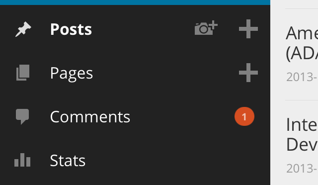
Under each of your blog names, you have many of the options you have when you are on WordPress.com from your laptop or home computer. These include Posts, Pages, Comments, Stats, View Site, View Admin. Tapping on any of these slide what was the post window back into view, only now it contains the thing you tapped on (well if it was the post page you tapped on, it will return to view).
The only time this isn’t true is “View Admin.” This option will close the app and open your browser, requiring you to login so you can now, if so needed, view everything available under the Admin Panel.
When you tap view site, you will be looking at an inline view of your blog with all posts flowing down the page: this is the mobile theme. The menu that would normally be across the top is now contained in a drop-down box labeled “menu”. If you want to view older posts that are not shown, there is a button to tap “Older posts” located under the first few. Under that, you will find your widgets.
Once on your site you will see an icon in the upper right that looks like an arrow pointing up from a box. Tapping this will bring up the social media options plus some added options: add to reading list, copy, open in safari, pocket, and Google+.
Then Slow Fall
![]() Under the top bar, there is the WordPress ‘W’ icon, that you can tap and get the drop-down menu shown on the left. I am fairly certain that on this device you can not see the whole list of choices, and there is no way to scroll down the list.
Under the top bar, there is the WordPress ‘W’ icon, that you can tap and get the drop-down menu shown on the left. I am fairly certain that on this device you can not see the whole list of choices, and there is no way to scroll down the list.
If you tap the ‘W’ icon a second time (not a double tap), you are taken to the reader, even though there is no indication that this should be the case. If you double tap the icon, it will zoom in.
Because a second tap after deciding you don’t need this context menu any more takes you to the reader, the only way to close it is by reloading the page (lower right).
On the W menu, if you tap ‘New Post’, you will see this screen. No matter which blog I was on when I tapped it, it always showed my “Justhroaway” blog in the drop down. This shouldn’t be a problem, but I was unable to interact with the menu on the page, nor could I see all the choices, only text and quote.
Slow Disintegration
When I tapped on the speech bubble on the black ‘W’ bar (for lack of another name for this mini-menu), the page froze and I was unable to post from this menu.
The Reader option works as intended, taking you to the reader to view posts by the blogs you follow.
The Notification option takes you to a list of likes and comments from all of your blogs. This particular version of the notifications option allows you to view the notifications in a drop-down style, and allow you to reply, approve, mark as spam. This differs from the other version greatly, and is a huge improvement.
The other Notification option, located in the left menu when you click the bars on the upper left, opens a new page when you click on the notification you want to view. On the Android, I am told that you can mark comments for approval in bulk and set them all to complete the action at the same time. I hope that they will eventually make this the norm for iOS 7.
On the app’s admin panel, I selected view site, and tried to edit a post. From there, I was taken to a full admin panel’s edit post and found that the editor is not responsive at all. You can’t see what you are typing unless you move the screen around as you type. In fact, if you try to flip your phone on it’s side, you can’t even do that much, because you can’t see the post text at all – only the app header and the keyboard.
I couldn’t get rid of the iPhone keyboard once it popped up either, so the only way to get out of this mess was to tap on the upper left menu and tap on something else.
I later learned that they never intended to include the full admin panel in the new app release for iOS 7, so I believe this is a bug. These issues do not exist if you edit your post from the app’s admin panel, however, so that is most definitely the way to go if you are not near a full size computer or laptop.
The reader page is mostly functional, but once in a while there will be two of every post from every blog you follow.
If you tap to read the full post you can comment (lower left), favorite/like (star bottom center), reblog (lower right), and use the social media slide up panel (tap upper right).
From here, you can not return to your app’s admin panel without first returning to the reader because the menu in the upper left corner is replaced with a back arrow on the individual post page.
Recap
At this point, I have found so many annoyances, errors, and bugs that my head is spinning, but the following recap is not all-inclusive by far.
The Ugly:
- The black bar that has the ‘W’ menu that is supposed to be located under the blog name and line menu bar disappears and reappears indiscriminately.
- After clicking on the ‘W’:
- You can not scroll the menu.
- You can not get rid of the menu by tapping it again, instead you are taken to the reader.
- To close this ‘W’ context menu, you must reload the page, or select one of the items.
- If you select new post from this menu:
- You can’t see all the options, only “Text” and “Quote”
- You must select a blog to post to, and it does not default to the current active blog. I believe it should.
- When you tap on the speech bubble, the page freezes with the loading indicator circling endlessly.
- When viewing a site, if you use the edit post option on a post, you are taken to the full admin panel. The mobile theme is thrown out the window in favor of an unresponsive full-size site. The post is not editable in this situation.
- Just had another buggy thing happen: The name of the top blog on the admin panel has been missing since I began using this app. It has suddenly appeared!
The bad:
- In many places, there is no indication that the app is working and that you should wait for it to finish.
- When you log in, you get swipe screens that tell you of the apps features. This should really only happen the first time you log in.
- After log in, you see the post page of the last blog selected to manage. It would be nice to see a “manage your blogs” screen or maybe just the admin panel instead.
- When editing posts and pages, there should be an easier way to move around what you’ve typed.
- It would be nice to get a warning that you are leaving the app that allows you to cancel when you tap “Admin.”
- The reader double post bug is a problem.
- You are unable to accept comments in bulk for approval, spam, etc.
- An extended text editing menu such as we see on the full version would be nice.
The Good:
- The ability to manage all your blogs on the go is great, and will be so much better once the kinks are worked out.
- The ability to view the reader and comment while away from home is also very nice.
Conclusion
I feel that this app could do with a good long testing session from the developers so that these issues can be fixed. This could be such a great app, but it’s just not there yet. I don’t believe they meant for their users to be their testers at such a low level, but really, that’s what we are.
All things considered, this app has potential, but as it is, I could never depend on it to write an entire post which needed code, media, or editing. I will continue to use it, but only for reading, commenting, and liking other posts.

Reblogged this on justhroaway and commented:
My review of the WP app as contributor on clarkwp.wordpress.com
Any opinions on the latest February 2014 iOS mobile app updates for WordPress.com? I’m curious if I’m the only one out here who is not too happy…
There will always be updates that aren’t perfect. Please submit your bug reports and sentiments in the WordPress Support Forum discussing the mobile releases. That is how things get better in the WordPress Community. Thanks.
I haven’t had a chance to use it, sorry!